
I'm really going to miss these fall afternoons.
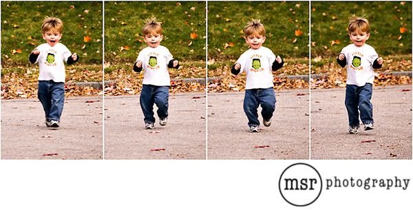
He runs everywhere these days. He sometimes gets all the way across our culdesac before I can catch him.
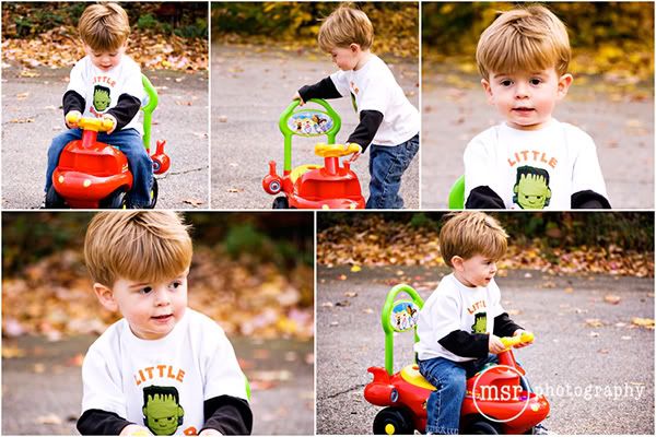
He had such a great time having the rocket outside.
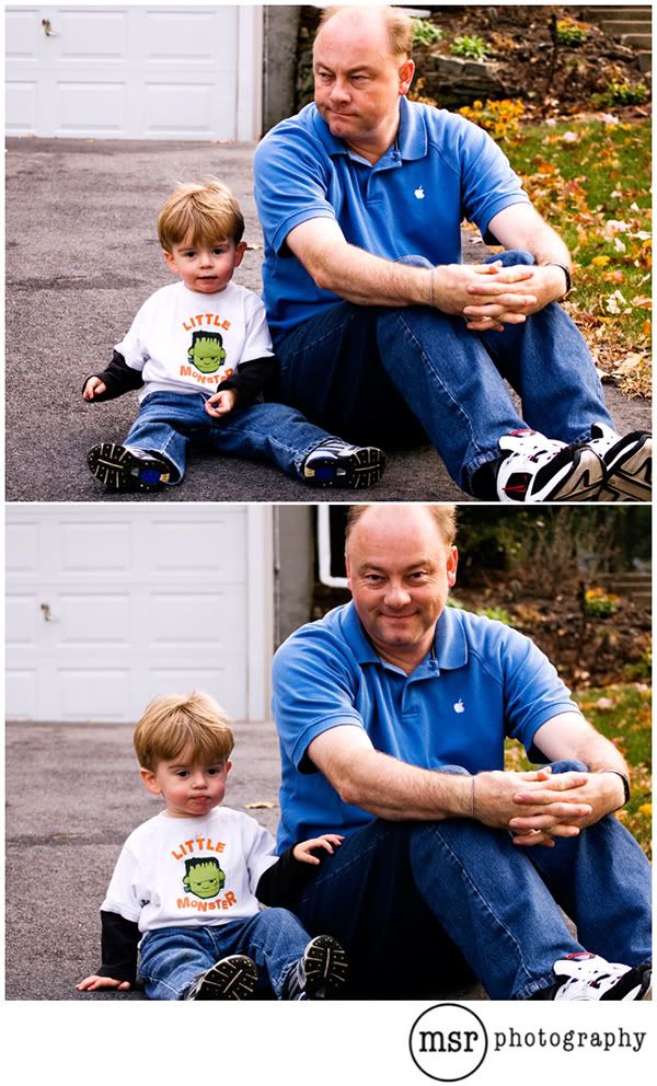
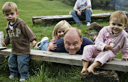
Aren't they just the cutest guys ever?
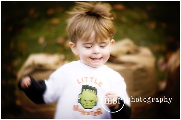
*So, I need a little bit of help. I'm trying to decide how to put my photography logo on my pictures. Both options are shown above. Option 1 is the white branding bar at the bottom with the logo in black. Option 2 is stamping the logo right on the photograph. Leave me a comment and let me know what you think!


11 comments:
Looks like G will miss these fall days too!
I'd use the stamp directly on the photo...it's harder for someone else to lift that way.
i like it OFF the photo, but rebecca has a good point.
Yes, I have to agree they are awfully cute ; )
Hmmm - after looking back and forth at the 2 different ways I think I like it right on the photo. And I will have to agree they are 2 of the cutest guys ever!
i think i like it best on the photo, unless it happens to be a photo where the logo really gets in the way.
I must be the odd ball, because I LOVE the logo in black on the bottom.
Cute pics!! We love our rocket too. Me and Matt both like the white, both look great but if I saw a super cute pic with a logo on the bottom that I could crop off I would be sure to steal it ;)
I like it stamped right on the photo!
I like the black... and maybe the bar could be just a tad layered ON the photo itself to keep anyone from stealing your shots!
i like the white, myself!
on the photo, but reduce opacity so it's a little less distracting? wanna show me how to make it? i will give you a hug?
Post a Comment